Android

Google’s Matías Duarte on the History of Smartphone Notifications

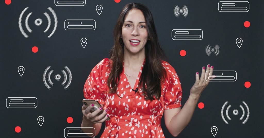
Daywise, modern smartphone users receive more than double the number of notifications per day than they think they’re getting—as many as 73 per day. (Anecdotally, Screen Time dashboard on my own iPhone tells me I’m averaging around 91 notifications per day.)App makers are trying every which way to grab a sliver of our attention. Psychological…

Daywise, modern smartphone users receive more than double the number of notifications per day than theythinkthey’re getting—as many as 73 per day. (Anecdotally, Screen Time dashboard on my own iPhone tells me I’m averaging around 91 notifications per day.)

App makers are trying every which way to grab a sliver of our attention. Psychological researcher Larry Rosen, who cowroteThe Distracted Mind, says he has spoken to app designers about their approaches and has concluded that their efforts to suck us into their apps is “really a business. The bottom line is, it’s a business. And the problem is they’re using behavioral scientists to help them design this.” More notably, Rosen’s research has consistently shown that notifications stress us out—and that constant notifications, beeps, buzzes, and vibrations from our smartphones and computers all contribute to ongoing chemical stress.

But it wasn’t always this way. Some of the earliest architects of smartphone notifications were simply trying to come up with ways to bring popular desktop communication apps to emerging mobile platforms. One of those people is Matías Duarte. His current role is head of material design at Google. But from 2000 to 2005, Duarte was the director of design at Danger, the predecessor to Android. (Remember the Hiptop, also known as the Sidekick? That was Danger.)

Duarte spoke with WIRED for the video above, digging up smartphone notification designs buried in boxes from nearly 20 years ago, and explained some of the early thinking behind smartphone notifications. An edited version of the conversation follows.

Lauren Goode:You were on the forefront of notifications before they were even called that. Talk a little bit about your history in designing what we now know as notifications.

Matías Duarte:I first started working in consumer electronics and mobile with the Danger Sidekick. This was just at the time when cell phones all looked like this, a nine-keypad at the bottom and a little tiny screen, and all you could basically do is text and [make and receive] phone calls. That’s it. There were no apps, no web browsers, nothing like that.

The first notifications were those little red voicemail lights on desktop phones. Mobile phones had these displays, which weren’t usually even colored. They were black and white … But you could use an icon to indicate when your phone was trying to get your attention because it would also have a little blinking light, right? About a missed call, or a voicemail, or about a text message. So you’d have two different little icons that were baked into that. So we knew that there was this problem of getting people’s attention and connecting people when we were working on the Sidekick.

LG:And this is well before Android, iOS, everything we know now.

MD:Yeah, absolutely. This was around 2000 when we were doing a lot of this design work. I think the very first one of these launched between 2001 and 2002. So this was all way before Android, although we have a connective lineage to these things.

LG:So you were designing just for the Sidekick’s little screen?

MD:For that tiny screen … Actually we started designing for this guy here. [Duarte holds up a small mobile device.] This is what we affectionately called the Peanut. It looks like one of those peanut cookies. This was basically a pager. That’s how you can think of it, except that it had a screen where we could show graphics and icons on it. This was the original product that we were going to make, although eventually we ended up making the Sidekick, which allowed you to communicate two ways just like you do today. And it had a keyboard.

The keyboard was the main appeal, and this meant that not only could you do emails like you would on a BlackBerry and type in your web pages faster, but you could text message. Not just SMS, but on what at the time was the hotness, which was AOL Instant Messenger. There was also MSN, ICQ. We had all of these on this guy here. In fact, we had the first mobile app store on the Sidekick.

LG:And this is a time before social media is really anything close to what it is now.

MD: Oh, there was no social media at the time … There were blogs.

LG: This was even before MySpace.

MD:This was the beginning of MySpace, the beginning of LiveJournal, that kind of thing, which is where this wonderful chart comes in [pulls out a paper chart]. Because part of the process of design is always understanding the problem space before you come up with a solution. And back then we did this analysis around w

Read More

Be the first to write a comment.

Leave a Reply

Your email address will not be published. Required fields are marked *

Android

Get the best of Bleeding Green Nation on the new SB Nation app

It’s a big day for Bleeding Green Nation. Today, the SB Nation app is live, and it’s the best way to follow the Eagles. You can download it by searching SB Nation for iOS or Android. A year ago we made some big changes to our community, including offering fewer ads and the addition of

It’s a big day for Bleeding Green Nation. Today, the SB Nation app is live, and it’s the best way to follow the Eagles.

You can download it by searching SB Nation for iOS or Android.

A year ago we made some big changes to our community, including offering fewer ads and the addition of the Feed. Today, we want to give you even more community tools and fewer ads with this app. It will make starting and joining conversations here as simple as posting to your favorite social media platform.

You can check out the video below showing off some of the useful features of the app, and we’ll dig into them below.

Why should I download the app?

The app will be the easiest way to interact with everybody else in the community:

  • All your favorite teams’ posts in one dedicated feed
  • Notifications when someone replies or recs your post
  • New game thread section, with an experience that’s smoother and faster
  • Fe

Read More

Continue Reading
Android

Get the best of Canal Street Chronicles on the new SB Nation app

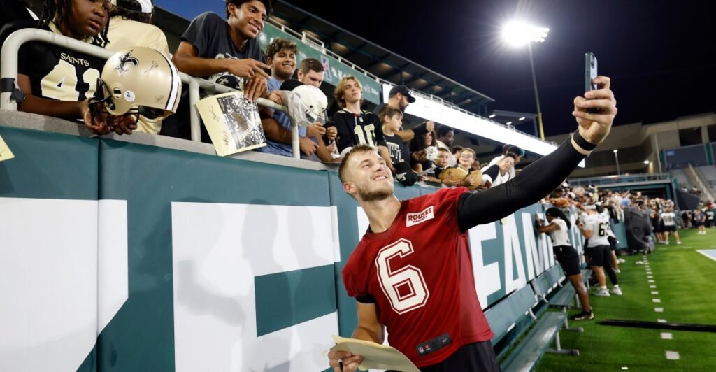
It’s a really exciting day for Canal Street Chronicles. Today, the SB Nation app is live, and it’s the best way to follow all the latest Saints news. You can download it by searching SB Nation for iOS or Android. A year ago we made some big changes to our community, including offering fewer ads

It’s a really exciting day for Canal Street Chronicles. Today, the SB Nation app is live, and it’s the best way to follow all the latest Saints news.

You can download it by searching SB Nation for iOS or Android.

A year ago we made some big changes to our community, including offering fewer ads and the addition of the Feed. Today, we want to give you even more community tools and fewer ads with this app. It will make starting and joining conversations here as simple as posting to your favorite social media platform.

You can check out the video below showing off some of the useful features of the app, and we’ll dig into them below.

Why should I download the app?

The app will be the easiest way to interact with everybody else in the community:

  • All your favorite teams’ posts in one dedicated feed
  • Notifications when someone replies or recs your post
  • New game thread section, with an experience that’

Read More

Continue Reading
Android

The Galaxy Z Flip 8 is at its best when there’s friction

What do you want from a flip phone when it’s closed? A simple interface, perhaps notifications and a widget or two, for handling the basics? Or a fully fledged Android experience shrunk down for the Flip form factor? For years, Samsung has insisted on the former, even as some fans — and Razr rival Motorola

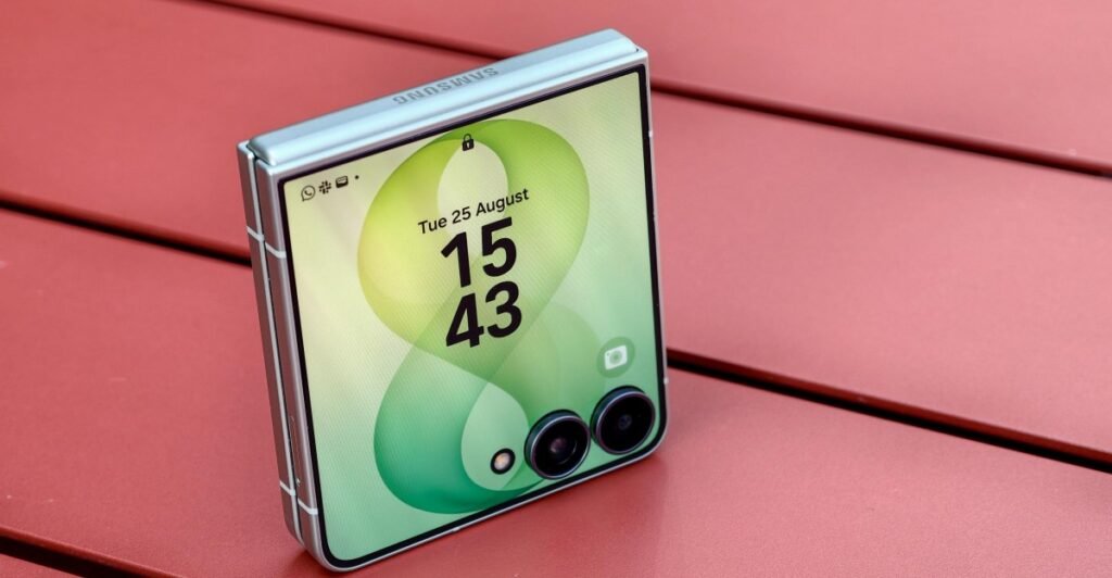
What do you want from a flip phone when it’s closed? A simple interface, perhaps notifications and a widget or two, for handling the basics? Or a fully fledged Android experience shrunk down for the Flip form factor? For years, Samsung has insisted on the former, even as some fans — and Razr rival Motorola — have pushed for the latter. With the Galaxy Z Flip 8, Samsung has given in.

Although the Z Flip 8’s hardware is almost unchanged year-on-year, Samsung has fundamentally rethought how this phone is meant to be used when shut. The cover screen feels more like a regular Android phone, with easier access to the full versions of every single app, letting you browse social media, watch movies, and play games without ever opening the phone. Not every app works well on a tiny square screen with two cameras in the middle of it, but even when they don’t, that friction between me and the distractions of my phone still feels as much a feature as a bug.

8

Verge Score

Samsung Galaxy Z Flip 8

$1200
$1200

The Good

  • Runs any app on the cover screen
  • Thinner and lighter
  • Reliable battery

The Bad

  • Mostly a rehash of last year’s phone
  • Still vulnerable to dust
  • $100 more expensive than the Z Flip 7
$1200 at Amazon$1200 at Samsung$1200 at Best Buy
How we rate and review products

Everything exciting about the Z Flip 8 lies in its 4-inch cover screen, which is now more versatile than ever thanks to a homescreen redesign. Swiping down from the top left now brings up your notifications, while swiping from the top right instead shows a cover-screen-optimized version of the Quick Settings panel. Immediately, this feels more like a phone.

More exciting is what happens when you swipe up from the bottom: you get an app drawer. By default, this is populated with a selection of Samsung’s own apps that are optimized for the square screen, plus a “Labs” section with third-party options including Netflix and WhatsApp. But right below that, Samsung has included an easy prompt to install MultiStar, the Good Lock module that lets you run any app you’d like on the outer screen.

Samsung used to bury the option deep in the phone’s settings, only to be found by those who knew to look for it. The bottom of the app drawer isn’t quite front and center, but it’s much more prominent than it used to be.

You can run any app you’d like on the cover screen.
The Withings app scales badly: The graph takes up too much space to even show both axes, and it becomes impossible to scroll past it.
Google Maps works, but it’s busy and awkward, especially when you try to zoom in.
HBO Max works flawlessly, but it wouldn’t be my first choice to watch Lanterns.

You can still run apps in three forms: full-screen, with the cameras blocking part of the software; a square display that stops just above the level of the cameras; or a thin portrait-aspect ratio that letterboxes the sides. A small virtual button at the bottom of the screen lets you cycle through them.

Good performance isn’t guaranteed. Some apps, like Withings’ health tracker companion app, are almost impossible to use on the cover screen, with no configuration that leaves enough space for its graphs to fit. Google Maps is only a bit better — I love the idea of quickly checking my walking route without opening the phone, but there are so many floating interface elements that it’s unwieldy at best. Others work smoothly, but feel pointless: I can stream HBO Max on the tiny outer display, but I’d never want to.

But for other apps, the new cover screen options feel genuinely freeing. I can open Todoist and tick off a task, dip into WhatsApp to send a message, or open MyFitnessPal to log the snack I just ate. They’re quick actions that work well enough on the small screen, and because other apps — *cough* Instagram *cough* — don’t, I can dive into them without the risk of getting dragged into doomscrolling. That little bit of friction is just enough to save me from wasting 20 minutes I’ll never get back.

Like last year’s phone, the cover screen wraps around the cameras.

As for the hardware, little has changed. The Z Flip 8 is 0.6mm thinner and 8g lighter than its predecessor. This is the thickest of Samsung’s three current foldables, but it’s more compact than Motorola’s Razrs, its only real rivals.

Samsung didn’t upgrade the Z Flip 8 with the thinner, tougher titanium display stack found in the two new Z Fold 8 phones, which also means this has just as visible a crease as ever. It rarely bothers me, and is hard to see head-on, but you may feel differently. The IP48 rating is a more objective issue, and means that while this phone is mostly safe from water, it’s still vulnerable to dust.

Related

  • Samsung’s Galaxy Z Fold 8 feels like the future
  • Samsung’s Z Fold 8 Ultra is more of the same, but better than ever
  • Samsung Galaxy Z Flip 7 review: more of a good thing

On the inside, you’ll find the Qualcomm Snapdragon 8 Elite Gen 5 if you’re in the US, though my UK model runs Samsung’s Exynos 2600. Exynos chips get a bad rep, but performance has been smooth so far, and I have no real complaints.

This is the online-exclusive mint, but the phone’s also available in pink, cream, and gray.
It’s a little thinner and lighter than before, but not by much.
And the crease is still pretty noticeable compared to the two new Fold 8 phones.

As with the Z Fold 8 phones, Samsung switched to more energy-dense silicon-carbon batteries for the Z Flip 8. Unlike those phones, it didn’t actually increase the battery capacity, but instead used smaller cells with the same 4,300mAh capacity — the key to shrinking the phone itself. Still, battery life is solid, reliably lasting the full day with battery to spare. The charging — 25W wired, 15W wireless — is relatively unimpressive, and the only way to get Qi2 charging is still by using a compatible magnetic case.

Storage and RAM remain the same as on the Z Flip 7; the screens do too apart from small bumps to peak brightness, and the cameras are also identical to last year’s. The 50-megapixel main camera is impressive, and especially helpful since the form factor means you can use it for selfies too. The 12-megapixel ultrawide and 10-megapixel inner camera aren’t remarkable, but they get the job done. A slab phone at this price would have better cameras, and most likely a telephoto lens, but the lenses here are good enough.

<em>The main camera mostly gets good results.</em>
<em>It even handles moving targets like pets (and string) pretty well, though it did split the thread a little at the top.</em>
<em>Details and color still look solid in dark basement lighting like this.</em>
<em>The ultrawide is a little more basic.</em>
<em>Pushing up to the maximum 1srcx zoom shows the camera’s limitations.</em>

1/13
The main camera mostly gets good results.

The question is whether it’s all good enough for the price, given Samsung has bumped the Z Flip 8 up to $1,199.99, a $100 increase. Z Flip 7 owners certainly shouldn’t upgrade, and anyone else should consider buying that phone instead, since the difference between the two is slight.

After all, the big upgrades are software, and unlikely to remain exclusive. Last year’s Z Flip 7 hasn’t yet been updated to One UI 9, but since its outer screen is almost identical, it seems likely to get the upgraded software, giving one less reason to opt for the new model. The Z Flip 6 and earlier, with their smaller cover screens, seem more likely to miss out. I’ve asked Samsung about its upgrade plans, but haven’t yet heard back.

Customizable Now Brief cards were added in One UI 9.
The camcorder-inspired video recording is still one of the phone’s best features.
If you find the full apps frustrating, various cover screen widgets are still available.

Most of the other software upgrades aren’t even Flip-specific. Customizable, AI-powered cards have been added to the daily Now Brief; My FanCam lets you crop video to focus on a specific subject; and Audio Eraser can now dim background noise and highlight dialogue in apps like YouTube and Netflix. You’ll find those features across all of Samsung’s new foldables, plus the new Galaxy S26 FE.

Modest as the Z Flip 8’s hardware upgrades are, it feels like a turning point for Samsung, which is mostly done trying to limit the ways people use the cover screen. Given the speculation that the short, wide Z Fold 8 could replace the Flip form factor as Samsung’s “small phone that unfolds to a big phone,” it makes sense to close the gap between them.

The Z Fold 8 is definitely bigger than the Z Flip 8.
But the Flip’s small, obstructed screen is less functional — for better or worse.
Open, the Z Fold 8 feels like a compact tablet.
While the Flip opens up to a pretty regular phone.

The Z Fold 8 is a more capable phone than the Z Flip 8 when closed, its squat screen more usable than the Flip’s tiny one, despite Samsung’s software upgrades. But I have a real soft spot for the Flip form factor, which is tiny and pocketable when closed and a normal, almost compromise-free flagship phone when open — and endlessly satisfying to flip shut.

More than that, I enjoy its frictions. I welcome Samsung’s move to make it easier to use full apps on the cover screen, but I also welcome that it will never be entirely successful. Some apps simply don’t work on a screen this size, and the Z Flip 8 is all the better for it.

Photography by Dominic Preston / The Verge

Agree to Continue: Samsung Galaxy Z Flip 8

Every smart device now requires you to agree to a series of terms and conditions before you can use it — contracts that no one actually reads. It’s impossible for us to read and analyze every single one of these agreements. But we started counting exactly how many times you have to hit “agree” to use devices when we review them since these are agreements most people don’t read and definitely can’t negotiate.

To use the Galaxy Z Flip 8, you must agree to:

  • Google Terms of Service
  • Google Play Terms of Service
  • Google Privacy Policy (included in ToS)
  • Install apps and updates: “You agree this device may also automatically download and install updates and apps from Google, your carrier, and your device’s manufacturer, possibly using cellular data.”
  • Samsung End User Licence Agreement
  • Samsung Privacy Notice
  • Samsung Terms and Conditions

There’s also a variety of optional agreements, including:

  • Provide anonymous location data for Google’s services
  • “Allow apps and services to scan for Wi-Fi networks and nearby devices at any time, even when Wi-Fi or Bluetooth is off.”
  • Send usage and diagnostic data to Google
  • Google Gemini Apps Privacy Notice if you opt in to using Gemini Assistant
  • Turn on Samsung offline finding
  • Samsung news and special offers
  • Samsung personalized advertising
  • Bixby personal data intelligence
  • Samsung customization service

Other features, like Google Wallet, may require additional ag

Read More

Continue Reading
Android

Elon Musk to launch XChat as part of push to build WeChat-like super app

Elon Musk’s social media platform X (formerly Twitter) said its instant messaging app XChat will launch on Apple App Store on April 17, as Musk pushes ahead with plans to build a super app similar to China’s WeChat. An Android release date has yet to be announced…

Elon Musk’s social media platform X (formerly Twitter) said its instant messaging app XChat will launch on Apple App Store on April 17, as Musk pushes ahead with plans to build a super app similar to China’s WeChat. An Android release date has yet to be announced…
Read More

Continue Reading